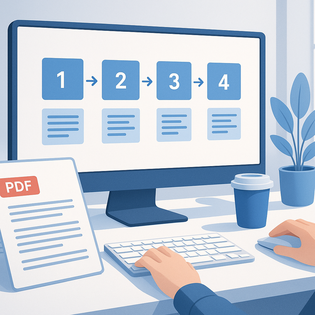
How to Create Interactive Presentations from Static PDF Reports
TL;DR
- Static PDFs are great for sharing, but they’re not ideal for storytelling or decision-making. Turning a PDF report into an interactive presentation lets your audience explore data, drill into details, and engage with the material using dynamic content and engagement tools.
- Start with a clean plan: audit the PDF, decide the story you want to tell, and map sections to interactive slide paths. Then choose a workflow that fits your team’s skills and data needs—convert, enrich, and embed live data where possible.
- Pro tip: Build a modular, reusable template so future PDFs can be enhanced quickly. Quick note: keep performance in mind—heavy media and live data can slow down delivery, especially over meetings with limited bandwidth.
- From my experience, teams that invest in interactivity see higher retention, more questions, and clearer decisions. Expect a 20–50% uptick in engagement metrics when you combine interactive elements with well-structured storytelling.
Introduction
We’ve all sat through a dense PDF report that looks polished on the page but folds under scrutiny when someone asks, “What does this actually mean for us?” PDFs are excellent for archiving, compliance, and distribution, but they’re inherently static. The moment you flip to a slide deck with clickable charts, drill-downs, and instant scenario analysis, the same content becomes a decision-making instrument.
Making the leap from static pdf to interactive presentation isn’t about reinventing the wheel; it’s about reimagining how to present the same data in a way that invites exploration and action. You’ll move from “here’s what the report says” to “here’s what you can do with the data right now.” You’ll show not only the numbers but the story behind them—how different assumptions change outcomes, which segments drive results, and what actions should follow.
In this guide, you’ll find a practical, end-to-end approach to creating interactive presentations from static PDF reports. We’ll cover planning, pdf enhancement concepts, how to add dynamic content and engagement tools, practical workflows, and how to test, share, and measure impact. You’ll come away with a repeatable method you can apply to annual reports, market analyses, dashboards, and executive summaries—without needing a PhD in code.
Pro tip: Start with a single pilot report and a small audience. It’s easier to iterate, gather feedback, and prove value before scaling to the entire organization.
Quick note: If you’re working under strict confidentiality or regulatory constraints, plan data access controls early. Live data can be powerful, but it also introduces governance considerations.
From my experience, the most successful teams treat this as a storytelling project, not just a tech exercise. They invest in narrative structure, clear audience objectives, and a lightweight, reusable design system. The result is a presentation that’s not only informative but also memorable.
Main Content Sections
1) Plan and Audit Your PDF Content for Interaction
Before you touch a slide or click a hotspot, you need a plan. A well-scoped plan saves you hours of rework and ensures the interactive elements actually deliver value.
Key steps
- Inventory and categorize content: extract sections, figures, tables, charts, callouts, appendix data. Identify core messages, decisions, and risks. Create a content map: which pieces of the PDF become slides, which pieces become interactive elements (hotspots, tooltips, toggles), and where you want the audience to drill down.
- Define the storytelling path: decide the narrative arc. For example, if you’re presenting an annual report, you might start with “What happened,” move to “Why it happened,” then “What we do next,” and finally “What this means for strategy.” Decide where you want viewers to branch into different scenarios or data subsets.
- Identify audience personas and goals: executives want concise takeaways and decision-ready insights; analysts might want data drill-down and reproducible charts; sales teams might need scenario modeling to test assumptions.
- Set success metrics: engagement (time spent, interactions per slide), retention (percent who view the entire deck), and actionability (percentage of attendees who indicate a recommended action). Quick note: align these with your meeting objectives so you measure what matters.
- Create a modular skeleton deck template: define 6–8 reusable slide blocks (Executive Summary, Key Metrics with dynamic charts, Data Drill-Down, Scenario Toggles, Methodology and Assumptions, Risks & Next Steps). Pro tip: use consistent color-coding and typography to reinforce the story and reduce cognitive load.
- Quick win planning: pick 2–3 low-friction interactive features you can implement in a day (e.g., clickable indicators that reveal micro-maps, a simple toggle that switches between “Actuals” and “Forecast,” or an embedded glossary that expands on hover or click).
What “pdf enhancement” unlocks here
- In the planning phase, you can enhance the PDF with clickable links, bookmarks, and alt text to improve navigation and accessibility. This is a useful bridge if you plan to revert content back to PDF for static distribution, or if you want to create a hybrid experience (PDF plus interactive presentation). Pro tip: keep the enhanced PDF lightweight; heavy media in PDFs can hinder performance when embedded into slides or web players.
- Quick note: make sure you have permission to reuse graphics and data. If a chart comes from a proprietary database, ensure you’re exporting an approved visual, with correct licensing and attribution.
From my experience, a good audit often reveals underutilized content that can be repurposed as interactive drill-downs. For example, a single KPI page in a PDF might become a “KPI Explorer” slide with a toggle for different regions, time frames, and scenarios. The payoff is usually a stronger line of sight into what drives performance and where to focus attention.
Pro tip: start with the simplest interactive element that adds value (like a toggle between “Year” and “Quarter” data) and only layer on more complexity after you’ve validated it with a pilot audience.
2) Techniques to Enhance PDF Content into Interactive Experiences
Now that you have a plan, you’ll translate static content into interactive experiences. This section covers the practical techniques—without getting stuck in code or overly technical jargon.
Core techniques
- Extract and reorganize content: pull key figures, tables, and narratives from the PDF and place them into a slide-based design that supports interactivity. Use data-driven charts whenever possible to avoid static numbers. If you’re consolidating a 100-page report, create a digest version with 12–16 slides that serve as the core story, plus optional detail slides.
- Add dynamic charts and live data (where appropriate): replace static charts with charts that pull data from a live source (CSV, Google Sheets, or an API) so your presentation stays fresh as numbers update. If live data isn’t feasible in a meeting, you can simulate it with a data-driven mock that updates via a quick toggle.
- Implement engagement tools: polls, quizzes, Q&A slides, and audience-driven branching. Tools like Pear Deck, Mentimeter, Slido, or built-in platform features enable real-time polling and feedback. Quick note: align questions with decision moments so responses drive the next slide or the talking points.
- Interactive hotspots and tooltips: overlay hotspots on charts or maps that reveal explanations, definitions, or notes when clicked or hovered. Tooltips can provide context without cluttering the slide. For PDFs, you can recreate hotspots in PowerPoint or a dedicated presentation tool and link to the corresponding slide sections.
- Expandable content and “accordion” sections: allow users to reveal more detail gradually (e.g., clicking a metric reveals underlying drivers, data sources, and methodology). This keeps slides clean while still providing depth on demand.
- Scenario toggles and what-if analysis: provide a few predefined scenarios (e.g., optimistic vs. conservative forecasts or best-case vs. worst-case budgets) and let the audience toggle between them. This is especially powerful for strategic presentations, budgeting, and forecast reviews.
- Media and multimedia: embed short explainer videos, audio notes, or animated GIFs to illustrate concepts that are hard to communicate through numbers alone. Keep media short (under 60–90 seconds) to maintain attention and avoid bandwidth issues.
- Accessibility considerations: ensure interactive elements are keyboard navigable and screen-reader friendly. Use descriptive alt text for images, clear focus outlines, and high-contrast colors to accommodate diverse audiences.
Pro tip: test interactions with a diverse group before the big show. A colleague from finance might click differently than someone from marketing, which helps you fix confusing labels or hard-to-find controls.
Quick note: performance matters. Live data, embedded media, and complex animations can slow down loading and playback. Optimize assets (compress images, reduce video sizes, keep number of layers reasonable) and consider hosting heavy assets on a fast server or content delivery network (CDN) if you’re presenting to a remote audience.
From my experience, the best interactive elements are those that solve a concrete audience need. If a toggle doesn’t change the decision context or reveal new insight, it’s probably unnecessary complexity. Start lean, then progressively enhance.
Practical examples
- Executive dashboard: a slide with a single KPI grid, linked to several drill-down slides. Each KPI tile offers a “drill” button that reveals a breakdown by region, product line, or time period in a next slide. This keeps the main deck concise while giving stakeholders control to explore.
- Market trends report: replace static trend lines with a web-based live data source or an auto-updating chart. Add a “scenario explorer” that shows how different market growth rates affect revenue and margins.
- Compliance or risk report: include an interactive glossary and a risk heatmap that viewers can hover to see definitions and data sources. Add a quick quiz at the end to reinforce key compliance requirements.
Pro tip: prepare two versions of slides—one lightweight version for low-bandwidth environments and a richer, media-heavy version for high-bandwidth rooms or online meetings. Quick note: always provide a downloadable PDF backup or a one-page executive summary for attendees who want a quick takeaway.
3) Tools and Workflows for Creating Interactive Presentations
You don’t need to be a programmer to create compelling interactive presentations from PDFs. There are practical workflows and toolkits that fit a range of skills and teams.
Recommended tool ecosystems
- PowerPoint with Live Data and Office integrations: PowerPoint remains a workhorse for most organizations. With Office 365, you can link charts to Excel data, embed Power BI visuals, and add action buttons for navigation. For meetings, you can export as a video, publish as a web-ready HTML5 deck, or share a live link with collaborators. Quick note: PowerPoint’s Morph and Zoom features help you tell a cinematic story without scripting all animations.
- Visual design platforms with interactivity baked in: Visme, Canva, and Prezi offer built-in interactivity for charts, hotspots, and scenarios. They’re especially good if you’re starting from scratch or want a more visual, presentation-first workflow. They typically support exporting as HTML5, which makes sharing online straightforward.
- Dedicated interactive presentation tools and audience engagement suites: Pear Deck, Mentimeter, and Slido plug into slide decks to enable live polls, Q&A, and audience interactions. These are ideal for workshops, webinars, and executive briefings where engagement matters as much as content.
- PDF enhancement and conversion tools: If your workflow begins with a heavily formatted PDF, tools like Adobe Acrobat Pro (for enhanced PDFs with links, bookmarks, and embedded media) and smallpdf/ILovePDF can help you extract content and generate print-friendly or editable formats. Quick note: enhanced PDFs can be a useful bridge, but they’re rarely the final deliverable for interactive storytelling.
Two practical workflows you can implement this week
- Workflow A: Convert and enhance, then present
- Export key content from the PDF into PowerPoint or Visme slides.
- Add interactive elements (hotspots, tooltips, and toggles) and embed live data visuals (Excel or BI visuals).
- Add engagement tools (polls, Q&A) and a short scenario explorer.
- Export to HTML5 or share a live deck link for online meetings.
- Test with a small audience, collect feedback, and iterate.
Pro tip: keep a “master” template that enforces the design system so future PDFs can be transformed quickly.
- Workflow B: Rebuild with a purpose-built tool
- Recreate the PDF content in a tool like Visme or Canva, leveraging built-in interactivity.
- Use data sources to feed charts directly (CSV, Google Sheets, or BI connectors).
- Add audience engagement features (polls, word clouds, quick feedback).
- Publish as an interactive deck with a shareable link or embeddable HTML.
- If required, offer a linked PDF version for offline reading.
Quick note: for highly regulated content (finance, healthcare, etc.), ensure all data transformations comply with governance and audit requirements. Keep versioned copies and maintain an auditable trail of data sources.
From my experience, a hybrid approach often works best: use a traditional PDF as the source of truth, enhance it with an interactive deck, and support with a lightweight live data layer where actions and decisions matter most. This reduces risk and makes the process scalable across departments.
Pro tip: build a simple “starter deck” that uses a small data set, a few interactive elements, and a clear narrative. Once you’ve validated the format with a pilot audience, you can scale to more complex reports.
4) Deliver, Share, and Measure Engagement
A great interactive deck is only as good as how it’s delivered and how you measure its impact. Here are practical steps to ensure your hard work translates into behavior and outcomes.
Delivery considerations
- Decide on the delivery format: in-person, live virtual, or asynchronous. For live sessions, ensure the deck is optimized for the room’s tech (projector resolution, clicker compatibility, bandwidth). For asynchronous use, provide a shareable link with offline-access options (downloadable PDF plus an HTML5 interactive version).
- Accessibility and inclusivity: ensure keyboard navigation, screen reader compatibility, and color contrast. Provide alt text for charts and images. Quick note: test with assistive technology to catch any blockers early.
- Data governance and security: if you’re embedding live data, confirm access controls, data refresh frequencies, and who has permission to view or modify data. Use secure data sources and avoid exposing sensitive information in shared decks.
- Documentation and handoffs: create a short companion document that explains the interactive elements, data sources, and how to update the deck in the future. This makes it easier for teams to reuse the format.
Engagement measurement
- Track interactions: number of hotspots clicked, toggles used, slides viewed, polls answered, and Q&A engagement. A good baseline is to expect at least 40-60% of participants to interact with at least one engagement tool in a well-designed deck.
- Measure dwell time and drop-off: compare how long attendees spend on interactive sections versus static slides. A healthy interactive deck often sees increased dwell time on key sections (example: +25–60% more time on data-driven slides).
- Collect qualitative feedback: end-of-presentation surveys or quick post-session interviews help you learn what worked and what didn’t. Use this feedback to refine your template and interactions for the next deck.
- A/B testing where possible: try two variations of a key interaction (e.g., a scenario toggle vs. a static scenario summary) to see which drives better decision clarity or satisfaction.
Pro tip: partner with a data-savvy stakeholder to interpret analytics. They can translate engagement metrics into concrete actions (e.g., “audience requested more regional breakdowns” or “they prefer short, KPI-driven summaries”). Quick note: don’t chase vanity metrics; focus on measurements that tie back to decisions and outcomes.
From my experience, the teams that package interactive decks with a clear business objective—and track the right metrics—turn presentations into decision engines rather than information monologues. The payoff isn’t just nicer slides; it’s faster alignment and more confident actions.
FAQ Section
- Can I turn any PDF into an interactive presentation, or are there limits?
- In practice, most PDFs can be transformed into interactive decks with varying effort. Simple PDFs with clean charts and text are easiest to convert. Complex layouts, heavy vector art, or embedded 3D elements may require re-creating visuals in a slide-friendly format. Quick note: plan to re-create core visuals rather than trying to auto-convert every element.
- Do I need to know how to code to create interactive elements?
- Not necessarily. There are plenty of no-code and low-code options. Tools like PowerPoint, Visme, Canva, and Pear Deck provide interactive features without programming. If you want live data with automation, some light scripting or BI connectors can help, but many teams achieve great results with drag-and-drop interfaces and built-in data bindings.
- How do I ensure the content stays up-to-date if the underlying numbers change?
- Use live data connections where appropriate (Excel Online, Google Sheets, BI visuals). If live data isn’t feasible, set a regular refresh schedule and keep a versioned data source. Pro tip: include a “Data Source” slide and a data-refresh calendar item so the team updates the deck consistently.
- How should I structure my deck to tell the right story?
- Start with a crisp executive summary, followed by a high-level KPI snapshot, then a narrative arc that delves into drivers, risks, and opportunities. Include a dedicated “Scenario Explorer” or “What-if” section to empower audience members to test assumptions. Quick note: end with actionable next steps and owners.
- How can I make interactive elements accessible to all attendees?
- Use keyboard-navigable controls, ensure visible focus indicators, provide alt text for images, and use high-contrast colors. Offer captions for videos and a text-based alternative for data-heavy visuals. Pro tip: test with a color-blind mode or accessibility checker in your authoring tool.
- What are common pitfalls when turning a PDF into an interactive deck?
- Overcomplicating the interaction, adding too many layers, or relying on heavy media that slows down loading. Another pitfall is assuming “interactive = better” without a clear purpose—every interaction should drive insight or decision. Quick note: start with a minimal viable interactivity and scale based on feedback.
- How should I share and protect an interactive deck?
- Use a platform that supports permission controls, audit trails, and versioning. Offer both a web-hosted version and a downloadable backup (PDF or offline HTML) for audiences with limited connectivity. Pro tip: provide a one-page executive summary alongside the interactive deck to accommodate different sharing needs.
- What’s the best way to handle data privacy when using live data?
- Ensure data sources are access-controlled and that the deck presenter has the appropriate permissions to view or share certain datasets. Consider data masking for sensitive fields and limit the scope of what’s exposed in the slide deck. Quick note: document data governance rules in your companion deck or workflow documentation.
Conclusion
Turning static PDF reports into interactive presentations isn’t just a cosmetic upgrade—it’s a shift in how you communicate insights and drive action. By planning carefully, enriching content with dynamic elements, leveraging the right tools, and focusing on audience needs, you transform a one-way document into a decision-ready experience.
Key takeaways
- Start with a solid plan: audit the PDF, define goals, map content to interactive paths, and build a modular deck template.
- Use pdf enhancement as a bridge, not the final destination: enhance navigation and accessibility in the PDF while you build the interactive presentation.
- Embrace dynamic content and engagement tools to invite exploration and discussion. A well-placed toggle, a live data chart, and an audience poll can turn attention into decisions.
- Test, measure, and iterate: pilot with a small audience, collect feedback, and refine your deck template for scale.
- Keep it accessible, secure, and shareable: design for all users, protect sensitive data, and provide convenient ways to access the content.
If you implement these steps, you’ll find that interactive presentations not only convey the data but also empower your audience to act on it. It’s the difference between showing what happened and showing what to do next.
Pro tip: treat every interactive deck as a learning tool. After each presentation, archive what worked, what didn’t, and how you’d improve the next version. A simple “lessons learned” document makes future PDFs-to-interactive conversions faster and more effective.
Quick note: the best results come from collaboration. Involve stakeholders from across departments early—finance, operations, product, and communications—so your interactive deck reflects diverse perspectives and meets real business needs.
By embracing pdf enhancement, dynamic content, and engagement tools, you’ll deliver presentations that are not just informative, but actively guide decisions—and that’s a win for everyone in the room.